Building an OBE Portal That Made Accreditation Information Easier to Find
How I organised engineering programme records into a searchable portal used during ABUAD's COREN accreditation review.
7 min read

In this article
- What I was working with
- Following the way a reviewer searches
- Search had to return useful answers
- Keeping 44 course compacts consistent
- Making dense information easier to read
- Dr Ojo's feedback after the review
- What I took away from the project
- Findability belongs in the product
- Structure the content early
- Write for someone outside the department
- The portal after accreditation
During ABUAD's preparation for a COREN accreditation review, the College of Engineering already had the records a reviewer would expect to see. The difficulty appeared when someone tried to move through them. Course compacts, handbooks, outcome mappings and departmental information covered a lot of ground, so someone following a single question could pass through several files and folders before reaching the exact record that answered it.
The brief was straightforward: make the material easier to find.
I built the ABUAD College of Engineering OBE Portal around that problem. It brought the College's programme information into one website, with routes that allowed a visitor to move from a department overview to its objectives, outcomes and course evidence. During the review, Dr A.O. Ojo showed the portal to the COREN representatives. His message afterwards was simple: they found what they needed.
What I was working with
The source material included Programme Educational Objectives (PEOs), the 12 COREN-aligned Programme Outcomes (POs), Course Learning Outcomes (CLOs) and PO-to-CLO mappings. There were also handbooks, departmental records, quality assurance information and 44 engineering course compacts.
One very long page would have been quick to assemble. It would also have left readers scrolling through the same mass of information, only this time in a browser. So I began with the relationships between the records. Which page should lead to a course compact? Where would someone expect to find a programme outcome? What should appear when a course code is searched?
Those questions shaped the site before I spent much time on its appearance.
Following the way a reviewer searches
A visitor might open a department page first, read its Programme Educational Objectives and then check how those objectives connect to the programme outcomes. The next stop could be a course compact showing the learning outcomes for one course. The navigation had to support that movement without forcing the visitor back to the home page after every step.
I grouped the content by department and by OBE concept. Course information, mappings and handbooks were linked from the places where they were most likely to be needed. The structure became much easier to understand once I stopped treating each document as a separate item and started treating it as part of a trail.
Search had to return useful answers
Page-title search wasn't enough for this material. A reviewer might enter a lecturer's name, a course code or a phrase remembered from a course description. Someone else might search for a handbook or a particular outcome.
I built the search index from the College's structured data. Results are labelled by category and link back to the relevant page, so a search for a course doesn't end at a loose text match. It opens a route into the course information itself.
That detail changed the feel of the portal. Search became a practical way to move around the site, especially for a visitor who didn't yet know how the College had organised its records.
Keeping 44 course compacts consistent
The amount of repeated information made hard-coded React pages risky. A correction to a department name or outcome could be made in one component and missed in another. With 44 course compacts in the portal, that kind of drift would be difficult to spot during a review.
I kept the content in a shared data structure and let the interface build its pages from that source. A simplified version looks like this:
export const collegeData = {
  computer: {
    name: "Computer Engineering",
    peos: [/* programme objectives */],
    pos: [/* programme outcomes */],
    handbooks: {/* programme guides */},
    courses: {/* course compacts and CLO mappings */},
  },
};
This gave the website one place to read the core records from. It also made gaps more visible. If a course compact or mapping was missing, the problem appeared in the data instead of hiding inside a page layout.
Making dense information easier to read
The portal contains formal material, and some pages are naturally long. I used clear labels, restrained colour and enough spacing to stop adjacent ideas from running into one another. The department navigation stays in familiar positions as the visitor moves through objectives, outcomes and course details.
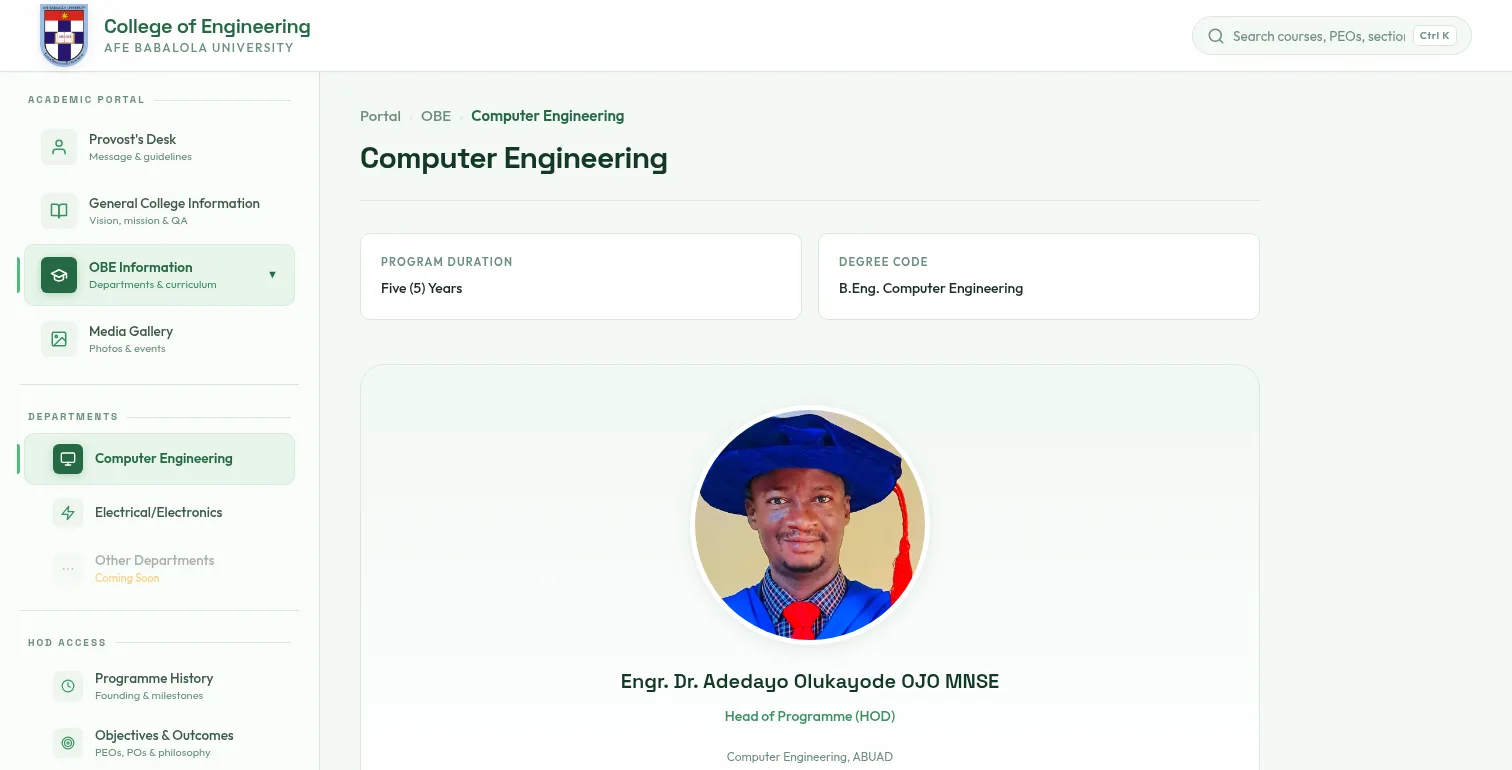
Mobile needed separate attention. A desktop layout has room to keep more navigation visible, while a phone can become crowded very quickly. The content stayed intact on smaller screens, with the controls adjusted to suit the available space.
The portal was built with React and Vite and deployed through Cloudflare Pages. The public URL could be opened by the accreditation team without an account or any local setup.
Dr Ojo's feedback after the review
After presenting the website to the COREN representatives, Dr A.O. Ojo, Head of the Computer Engineering programme, sent this message:
"This website was very good. I showed it to the people from COREN, and they were impressed. They found all they needed, and your speed was incredible. Thank you."
The line I remember most is "They found all they needed." It was a direct test of the work. The portal had been built around retrieval, and the people using it during the review were able to reach the information they came for.
Accreditation came from the programme's curriculum, staff, facilities, processes and evidence. The website had a narrower job: make that body of work easier to inspect. Dr Ojo's message confirmed that it did its part.
What I took away from the project
Findability belongs in the product
A record can exist and still be practically unavailable. If only the person who filed it knows where it is, a visitor is going to struggle. On a site like this, search labels and links deserve the same care as the visible design.
Structure the content early
Working out the data shape first saved time later. It reduced repeated content and made inconsistencies easier to catch before they reached the interface. For dense institutional websites, this early work affects almost every page that follows.
Write for someone outside the department
OBE has its own vocabulary. PEO, PO and CLO are normal terms inside an engineering programme, but a visitor still needs enough context to understand where each one fits. Plain explanations helped the formal records remain readable without changing their meaning.
The portal after accreditation
The review gave the project a clear deadline, though the website remains useful beyond that event. Students can look up programme outcomes and course compacts. Staff have a public reference for department information, and visitors can see how the College documents its OBE process.
For me, that is the useful part of this project. A large collection of records became something people could actually move through when the information mattered.
You can visit the live ABUAD Engineering OBE Portal or view the source code on GitHub.
If your organisation has a similar collection of important information that people struggle to navigate, we can discuss the project here.